Usage rate is a metric that shows what percentage of a team’s total touches on the ball an individual player is responsible for. Receiving a pass, dribbling and then sending a pass counts as one touch. Assume, in a given match, that Liverpool records 880 touches across all of its players and that Mo Salah accounts for 66 of these touches. Salah’s usage rate is then 7.5% (calculated as 66/880). The simplicity of usage rate allows for an easy comparison of how involved individual players are in their team’s actions. However, due to the nature of the metric, the more minutes an individual player is in the game, generally the higher his overall usage rate will be (making comparisons across players with vastly different playing times nonoptimal).
Average passing distance sounds like exactly what it is — the average distance a completed pass travels (in yards). Again, in the example of Mo Salah, he has thus far completed 616 passes, for a total distance of 9,278 yards resulting in an average passing distance of 15 yards (9,278/616). Average passing distance can be broken down into more granular detail (progressive/nonprogressive passing distance, passing distance in each 1/3rd of the pitch, short/medium/long passes, etc.), which is something that will be revisited in further posts.
So, using the above definitions, we plotted these 2 metrics for all players in the English Premier League this season, with the restriction that players must have played a minimum of 900 EPL minutes (equivalent to 10 full games). Looking at Figure 1, we can identify 2 immediate clusters, the first encompassing all goalkeepers, while the second includes all outfield players.
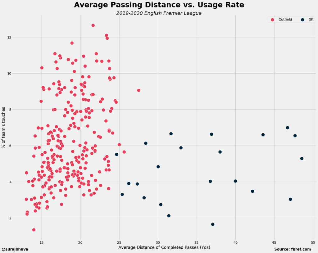
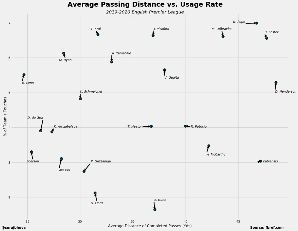
Keepers tend to have much higher average passing distances, which intuitively makes sense as most of their passes likely come as they play the ball out of the back (in the case of high pressing or back passes) or from goal kicks. Even within all keepers, there is a lot of variance in passing distance and usage rate (is it a coincidence that the top 5 team’s keepers have the shortest passing distance?). Bernd Leno actually creeps into some of the outfield players’ space with his relatively high usage rate and relatively short passing distance.
Now, looking only at outfield players, we can divide the players into four quadrants, reflecting whether they tend to play short or long passes and if they are low vs. high usage players (both relative to the average).
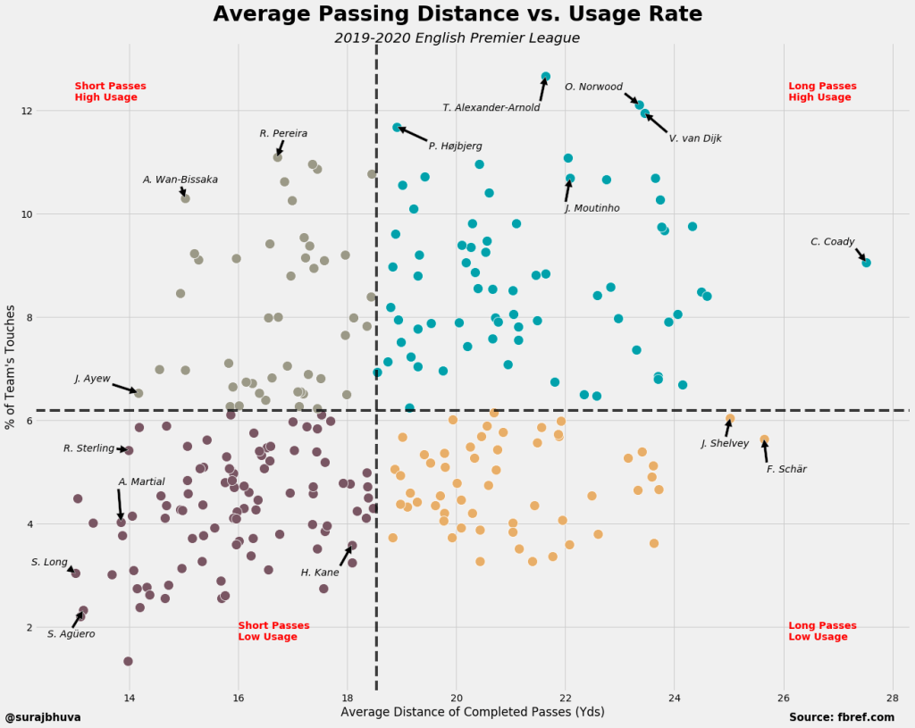
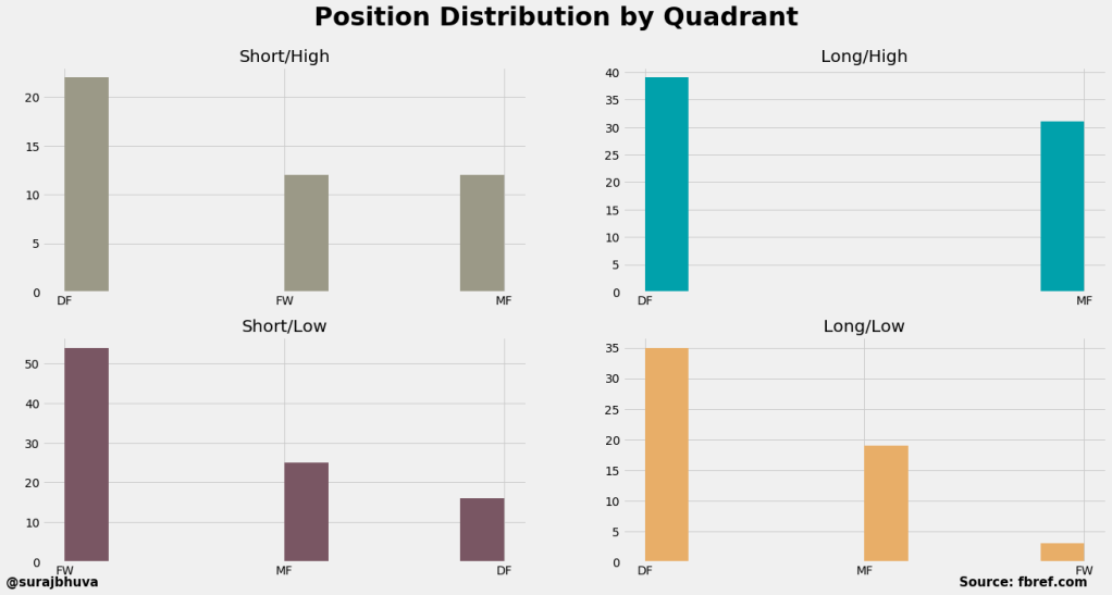
The lower left quadrant (short passes, low usage) includes a lot of high name forwards, again reflecting the nature of how a forward tends to play — short passes while not really touching the ball a lot. In fact, Figure 4 looks at the distribution of player positions by quadrant, and it becomes obvious that each quadrant tends to represent a specific “type” of player. The lower left quadrant is mostly composed of forwards; the upper left quadrant is split between defenders and forwards+midfielders; the upper right quadrant is a near even split between defenders and midfielders; and finally, the lower right quadrant is mostly purely defensive minded players.
While there are some drawbacks to the usage rate metric, looking at this in conjunction with average passing distance can help identify how a player is performing in his position (i.e., if we see a forward migrate to the right quadrants, this is likely an indication that they are making passes which are “too long”).
